Set Project: Flipbook Process
To begin with I began my flipbook by logging onto flipsnack.
Below I was debating on whether or not I should choose the A4.
Then the booklet.Then to put my own measurements.
But finally I chose the presentation look as it would accentuate the pieces better as it has more space.
I firstly added add heading in order to put the Azazel.
I was debating on fonts.
Along with sizes.
But then finally chose the font italiana and size 88 as I believe it fit the theme of the fallen angel.
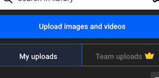
I then chose my uploads and began uploading my designs, logos to add them to the front cover page along with other pages and then cropped my images in order to fit to make the cover page.
This is me cropping but I could not reveal the final outcome.
I then increased the size of Azazel to 144 as I flipped it to the side and it had to be bigger to give emphasis to the collection.
I then changed it to 192 to make it even bigger.
I then began creating the pages for the looks and added the heading and text boxes.
I was looking at fonts and chose italiana again in order to match.
I then chose abel size 30 for the text.
I cropped the colour palette to fit.
And then flipped it to 90 degrees to put it under the name.
I then added the pictures for Raziel and tested the layouts.
I continued testing.
I then added the introduction.
Then the logo on the last page and on the other pages as copyright.
I then changed the background to black for the final presentation.
And that was it. I love my portfolio and I am extremely satisfied with my work.


Comments
Post a Comment